Get Inspired With These Must-See Viewbooks
For post-secondary institutions, a compelling and creative viewbook is no longer an option, but an expectation. We've compiled some of our favourite 2016 viewbooks to get you inspired and thinking about your options for 2017.
OCAD University
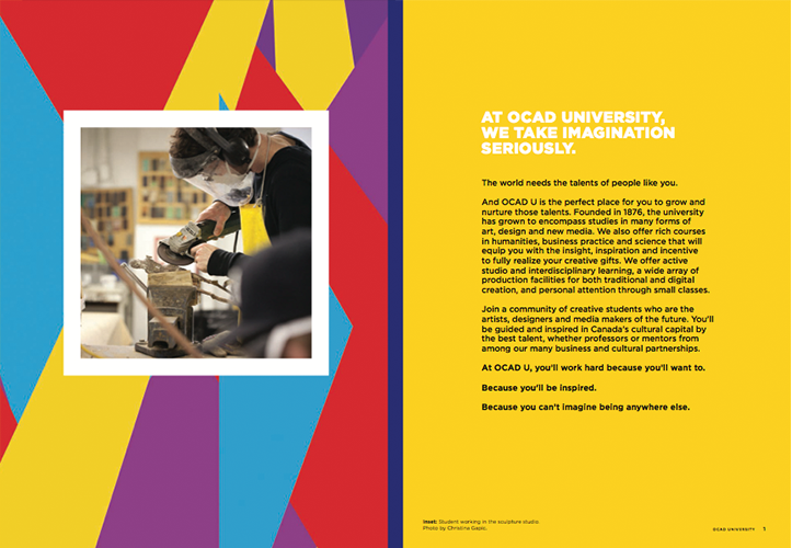
Bright and vivid, the OCAD University 2016 Viewbook draws you in immediately. With a theme of "imagination," the copy speaks to inspiration, creativity and talent, creating an exciting picture of what University life could be for its prospective artists, designers and media-makers. Naturally, they also include the technical details and admission requirements, but even there the tone remains exciting and inspirational.
Yale
Yale keeps things simple with the title page solely containing their name. Really, do we need to say more? With a Pinterest-like layout, their viewbook shows the atmosphere and culture rather than focusing on the "details" with clever subsections covering Yale lives, studies, places, pursuits, and a fresh take on applying. They then get into "Freshman diaries" which uses compelling stories to draw people in.

U of T
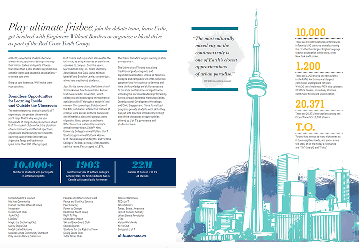
U of T focuses on their extra-curricular offerings, encouraging students to "think outside the classroom.” Combining vivid illustrations with sharp photos of the campus, they emphasize the fast-paced, city lifestyle and culturally diverse city for prospective students. One strong addition is finishing with their call-to-action: scheduling a campus visit.
Syracuse University
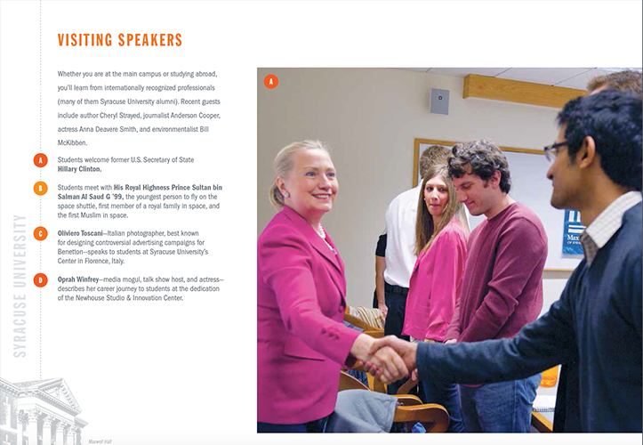
SU offers two versions of the same viewbook. Rather than just focusing on overall student recruitment, they’ve put an emphasis on international students by tailoring one of the viewbooks with a section titled “international voices” featuring direct quotes from past and current international students. Both viewbooks also have a section dedicated to guest speakers, the likes of which include Hilary Clinton and Oprah Winfrey.
Oxford University
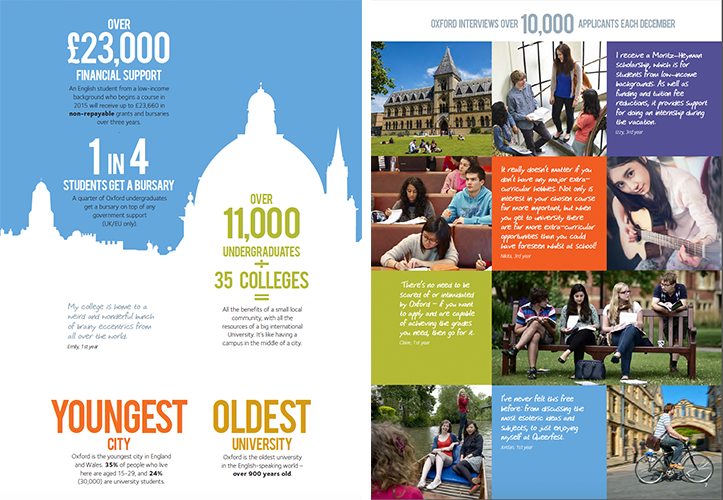
Called the Undergraduate Prospectus, Oxford University’s take on the viewbook aims to remove the intimidation tied to applying there. Bucking the trend of formality that many of it’s contemporaries stuck with, Oxford attempts to dispel with the perceived stuffiness associated with their school culture. The title page displays pictures of a diverse group of students, followed by their revelations about how great the school is, a theme accentuated throughout the book with bright colours, energetic infographics, and short, casually-written testimonies on almost every page.
---------
These viewbooks all have one thing in common: they focus on their strengths, identify what makes their institution stand out from the crowd, and weave this message into every part of the document. Regardless of the size or prestige of your institution, it's less about sharing every fact and figure, and more about teasing out your brand and communicating it in an exciting way that makes a future there easy to imagine for prospective students.
-------
Vivid Shift is a recruitment marketing agency based in Western Canada. We help organizations share what makes them unique so they can attract the right employees, volunteers or students. Find out more at www.vividshift.com.
Subscribe
All the recruiting news you see here, delivered straight to your inbox.
Just enter your e-mail address below
RecruitingBlogs on Twitter
Groups
-
Recruiters On LinkedIn
1801 members
-
Corporate Recruiters
316 members
-
Recruiting tips for begi…
180 members
-
The Recruiting Bar
190 members
-
Recruiting Humor
222 members
-
News from the Recruiting…
34 members
-
Contractors Recruitment
62 members
-
Recruitment Process Outs…
194 members
-
Virtual Recruiters Netwo…
619 members
-
Independent Recruiters
530 members
© 2025 All Rights Reserved
Powered by
![]()
Badges | Report an Issue | Privacy Policy | Terms of Service
About
With over 100K strong in our network, RecruitingBlogs.com is part of the RecruitingDaily.com, LLC family of Recruiting and HR communities.
Our goal is to provide information that is meaningful. Without compromise, our community comes first.
Join the Network!
RecruitingDaily.com
One Reservoir Corporate Drive
4 Research Drive – Suite 402
Shelton, CT 06484
Email us: info@recruitingdaily.com

You need to be a member of RecruitingBlogs to add comments!
Join RecruitingBlogs