Best Mobile Recruiting Software: Statistics, Benefits and a 5-Steps Guide to a Successful Mobile-First Strategy
Do you know that normal UK Gen Zers can spend an average of 10.6 hours online daily?
25% of Millennials spend more than 5 hours on their smartphone each day. For the other 50%, the amount of time spent is 3 hours.
Smartphone and IoT Consumer Trends Study– B2X
What can recruiters learn from these numbers? It is time for them to build innovative mobile recruiting software to incorporate a growing worldwide trend: Mobile-First Design.
This article will clarify the concept of mobile-first, why recruiters should apply it in the recruiting process, how to incorporate it in your hiring program, and lastly, give you some real-life mobile-first examples.
Mobile Recruiting Software – What is Mobile-First Design?
How do you feel about your company’s website or your chosen mobile recruiting app? Is its design supporting or harming your campus recruiting strategy? Studies have shown that most people will stop engaging to a site if it has a poorly designed interface. When it comes to creating a website, the information provided is important. However, the aesthetics of the site and the convenience of using it also matter.
To understand the history and notion of the mobile-first approach, let’s get to know about the two major concepts related to responsive web design. They all help to provide users with intuitive displays on different devices.
Graceful Degradation: basically means that you “gracefully degrade” your full-feature design to a simpler version by taking the layers off. It is when your web design starts from an advanced version which is usually available only for modern browsers on larger screens such as desktops. And then it will be adjusted to be compatible with small screens (mobile phones, tablets…). This can be done by cutting down some effects, functions or contents.
Progressive Enhancement: on the contrary, it means that in the beginning, you put your effort into a version with essential features and short-form content. This version brings the most comfortable experience for users on less modern browsers. Then you create advanced versions for platforms that support higher performance by adding more complicated effects, functions, etc.
These two concepts seem almost identical, but progressive enhancement is considered a more practical approach. It requires designers and web makers to develop the best solutions for the restrictions on size, features, content, etc.
Developers can encounter this problem when creating a mobile version that is expected to deliver necessary information and bring users the most easy-to-use and comfortable display on their touchscreens. Therefore, your mobile version will be a polished and completed design. You don’t want it to be a backup solution for the lack of mobility of the desktop version.
Here’s an illustration for the disadvantage of graceful degradation compared to progressive enhancement:
Graceful Degradation:

Progressive Enhancement:

Besides, upgrading your basic website to a more abundant version sounds much better than having to give up on appealing features that you have created from the start. It saves designers and web makers lots of time and improves their productivity.
The process of progressive enhancement is exactly the same as the mobile-first approach. It is creating a website/an application for a mobile device first, then adapting it to larger screens. And that is one of the reasons why mobile-first responsive design is highly recommended for web design when it comes to effective recruiting programs.
Why Mobile-First Design?
Mobile Use is Exploding
According to research done by Statista, there will be nearly 50 million mobile-only internet users in the US in 2019.
According to Google, 77% of mobile searches occur at home or work where desktop computers are likely available.
These numbers never seem to stop growing over time. With the development of mobile recruiting software, these data are worth taking into consideration. They prove the rise of mobile use over desktop use and urge web makers to change their way of thinking that an all-inclusive desktop design should be targeted first – for now, it’s probably not!
In their “2022 Global Internet Phenomena Report” Sandvine predicted rapid growth of 1 Terabyte per month of internet usage due to mobile apps usage.
Google and Bing have already used mobile-friendliness to rank mobile search results. From March 2018, Google has switched to “mobile-first indexing.” It will predominantly use the mobile version of a page’s content to evaluate the relevance of a page to a user’s query.
Mobile-First means Content-First
Creating a website/app for mobile devices as a part of your campus recruiting strategy means that you have to face a lot of problems related to content.
For example, you have to make sure your text is readable without zooming or scrolling too much; the content must be concise but still inspire users towards your products or services. And a (fun) fact about the average time-on-site from Hubspot:
Up to 55% of visitors spend less than 15 seconds on your website.
So keep in mind: Stay focused on the content! Making it appealing to candidates can be challenging at first. But once you figure the way out, your site will be the spotlight of your campus recruiting strategy.
Creating a firm foundation and finding your “key selling points” before progressively enhancing your site/app is essential. That’s why we suggest mobile recruiting software for your hiring process.
One Step Closer to Candidates
The mobile-first approach is one of the best ways to bring employers closer to their prospective candidates. For this reason people of any age from anywhere are all seeking convenience. Most candidates expect to find their ideal jobs with their mobile devices.
The number of mobile job searches exceeds 1 billion every month, and at least 90% of searchers browse through career sites through their mobile devices.
37 Little-Known Hiring Stats & Trends for 2021– GoRemotely
Another advantage of mobile-first hiring trends is that you can engage with candidates on the go. It is totally possible for employers to get their news (upcoming events, open positions, campus recruiting activities, introduction videos, etc.) immediately notified to their prospects or app users with push notifications. Recruiters can even interact personally and responsively with candidates anywhere, anytime with texting and calling features on mobile recruiting software.
Remember that candidates will bring their phones with them throughout their job-hunting process. They use smartphones and tablets to search for and apply for jobs.
They use their devices at career fairs to research and scan companies’ information, etc. In this candidate-driven market, recruiters can’t just sit there waiting for resumes to come to their mailboxes. The more you engage with candidates through mobile connections, the more talents your company can reach out to and connect.
A Less Time-Consuming Campus Recruiting Strategy
Mobile recruiting software is now widely available in different operating systems’ app stores. Recruiters can utilize these apps in an on-campus job fair to capture and evaluate candidates.
There are also mobile-friendly tools that help recruiters and candidates schedule interviews effectively without any inconvenience. Mobile recruiting software can significantly help campus recruiters save time and be more productive while improving candidate experiences.
What Can Drive Visitors Away
Creating a mobile-first design is similar to developing a successful product. To start mapping and developing a practical design, one must know what works and what doesn’t. This section will discuss factors in a mobile site or app that can drive your potential customers away if not done correctly.
Load Time

Before getting to the nitty-gritty details, a developer team must optimize their site’s load time.
When it comes to visitors’ experience, you will see many content advocating optimizing the website’s speed and fluidity. When your targeted visitors are job seekers (especially young graduated candidates), expect their patience to be shorter than someone strolling the internet for a new TV.
The longer the loading time, the more likely visitors will quit your site before seeing any visuals.
According to a website optimization survey by Kinsta – a WordPress hosting platform:
74% of mobile users in the US are likely to bounce from mobile sites that don’t load within five seconds.
Loading time affects your conversion rate significantly. Without a proper load time, your visitors will have trouble navigating your site and won’t be able to see your “call-to-action” sections in time.
Navigation
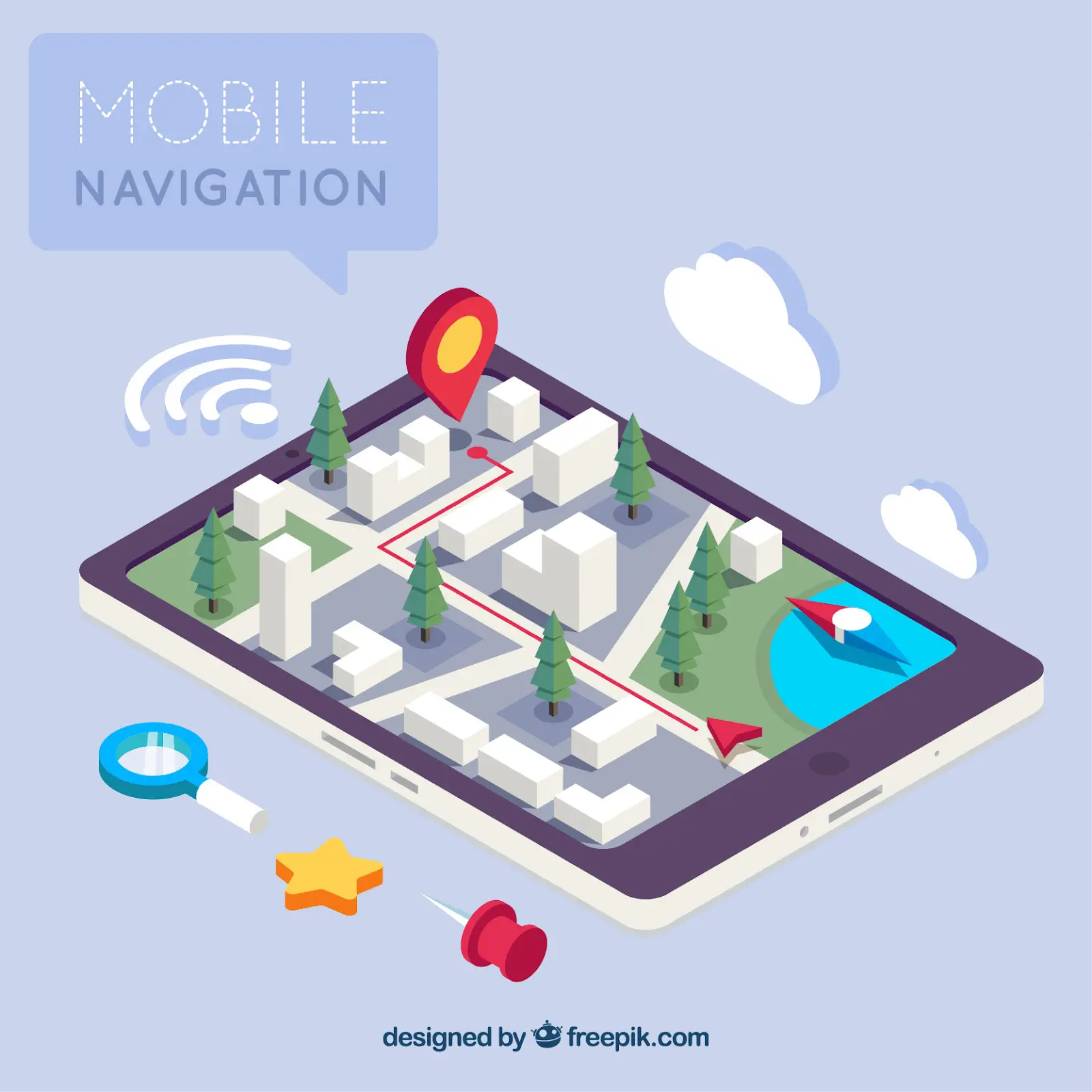
Another factor that significantly affects visitors’ experience is your site’s navigation path design. Imagine asking an average person to name every function on an airplane’s dashboard. You can easily overwhelm your visitors with messy and cluttered designs.
When it comes to navigation, the term “fewer is better” applies the best. From your visual design to the wording of your navigation bar, having fancy transition animation is good, but responsive and straightforward navigation is always the best. If your navigation bar is too cluttered with categories, consider going back to the drawing board and trying a different grouping.
Organize Your Content

Now that you have cleaned up your navigation, it’s time to move to the site’s content. Like site navigation, the content of a page, both in writing and visual, must have some logic. Most websites will follow an order of:
- Navigation Bar
- Visual banner and title
- Product Description
- Company information and more navigation options at the end of the site
It shouldn’t take your visitor too long to find the “About Us” page or the sign-up section. If you decide to put your sign-up page/form in the blog tab, few visitors will be patient enough to find it.
By providing a comprehensive browsing experience, you are one step closer to getting a subscriber. With how advanced bot technology is in 2022, some sites even program their chatbot to help direct visitors to different sites upon request.
Don’t make your visitors rummage your site for what they need. Present it to them!
Ads
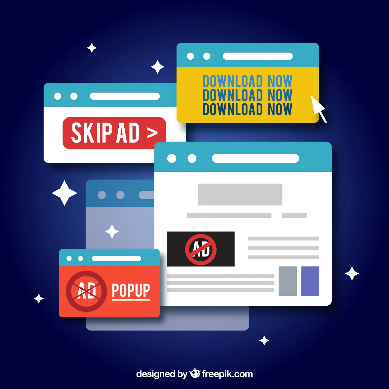
While ads are an unavoidable part of internet browsing, how you design and situate your ads can mean a difference between gaining a subscriber and losing them.
Out of 1348 Internet users interviewed in the Merkle “Consumer Experience Sentiment Report” 44% said online ads often feel intrusive.
When you first visit the website, getting swarmed by dozens of ads (especially those that block the actual content of your site and require you to turn it off manually) is very unpleasant for many people.
Ads work best when you spend some time strategically placing them at key positions. For example, as a visitor is about to exit the page, a pop-up suggests more helpful information or a program mentioned previously on the page.
Unprompted Sound

Visitors can access your site any time of the day, so having their phone play sound and music from your site in a middle of a train ride or a meeting might result in decreasing the conversion rate.
One way to guarantee a positive experience is for your visitors to have complete control of their browsing experience. If you want to feature videos on your site, you can either let visitors decide to watch it or not, which means no auto-play. Another approach is using soundless video with a high emphasis on visual cues and messages.
How to Create a Mobile-First Design?
Creating a design for mobile devices is all about user experiences. Many criteria need to be met to maximize users’ satisfaction. Some of them are related to technical requirements that designers and web developers have to deal with. However, this section will focus on the key aspects recruiters need to consider to control their mobile-first designs for a successful hiring process. Consider checking this video by the talented Adrian Twarog on YouTube for a more hands-on tutorial.
Enhancing your mobile-first experience
A mobile recruiting app with an optimized design won’t do you any good if your team does not have a mobile-first recruiting strategy. Consider these best practices to find and recruit your candidates through mobile devices.
Consider the Length and Formatting of Your Forms
Not all mobile devices are the same. Newer models will have no problem interacting with multi-media content, like filling out forms or viewing high-quality images and videos. However, it’s a different story for older models. For the best mobile recruiting experience, make sure the content you want to reach your target audience is optimized for most mobile devices.
A general rule of thumb is to keep forms as compact as possible. For mobile forms, this rule is even more critical. With limited typing and reading space and smaller lettering, no one likes to spend 10 minutes filling in a badly-designed mobile form.
Whether attaching a form on your mobile site or sending it through a mobile recruiting app, see if your team can keep things on a single page. If your document is simply too long to fit on the screen, try to break it into sections where each section can fit on one screen. This way, readers can better understand your content and keep track of where they are.
Shorten Your Recruiting Process With a 1-Click Apply Function
Like recruiters who want to sort out qualified applications quickly, candidates also want to have a seamless and quick application process. A candidate can browse for jobs during break time and find your open positions. If they are met with a lengthy application form, the candidates will be less inclined to sign up for the position and would likely forget about the opportunity after returning to their work. Allowing them to apply with just a click gives you more chances of receiving applications from experienced and busy folks!
Automated Your SMS Campaigns

Any recruiting campaign requires time and dedication from the recruiting team to reach out and build solid relationships with their leads. If your team is recruiting through text message campaigns, automating your SMS touches is the best way to make use of the best parts of mobile recruiting: instant and straightforward.
SMS recruiting solutions like Rakuna Text Recruiting Solution can help keep your leads engaged, while recruiters can have more time to add personal touches tailored to each candidate. Automating your SMS with a mobile recruiting solution also allows your team to track a wide range of information from your candidates. Data like reply rate, reply time, or simply their response to questions can help recruiters to understand and adjust your mobile recruiting strategies.
Content
As mentioned above, mobile-first hiring trends need to be content-focused. For example, a mobile recruiting software’s main feature is a small-sized layout that does not allow too much information on such limited display space.
The first step for great content is deciding which elements are essential and which are not. The critical information needs to be displayed prominently while removing or hiding unnecessary bits.
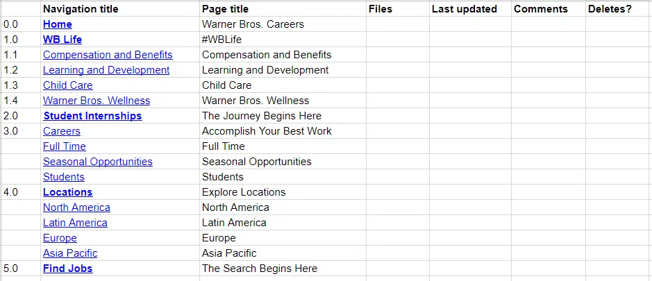
Then, creating a content inventory spreadsheet is advisable as it helps you list out and see clearly what you want to include in your website/app. Remember to follow that list throughout the designing process to avoid rambling content. Here’s an example of a content inventory illustrating Warner Bros’s career page:
Visual Order
Start creating a visual hierarchy of your mobile website’s most to the least essential elements with your content inventory. Depending on the purpose of your site, you now have a prioritized list of visual elements.
Here are a few more things to consider:
- You also need to consider that many candidates use their mobile devices to search for jobs on the go. So, try to keep the content short and easy to read/understand.
- Helpful content for students can make your site more attractive to Millennials and Gen Zs alike. For example, notifications of part-time jobs, internships, career fairs, campus recruiting events, etc. Remember this when creating your prioritized list.
- You can consider including blogs or articles on relevant topics such as interview tips, career orientation, etc. It makes your site a helpful information site for students and fresh graduates.
- If you want to include calls to action, remember to make the buttons easy-to-see to attract interactions.
- Another top priority that any designer needs to consider when building a mobile site/app is the text font. All the text needs to be large enough to be read on different mobile devices without zooming in. So, be careful when choosing fonts for your site.
Speed
Speed is also an essential determinant of your web/app success or when finding a mobile recruiting software.
In fact, from July 2018, Google has officially made page speed a ranking factor for mobile searches.
Web developers need to carry out techniques such as caching plugins, CDN, HTTPS protocol, etc., to improve page loading speed. These setups also help boost a page’s security and deliver page content based on users’ geolocation.
Another point to consider is to avoid including complex, large-sized graphics or videos on your page, as they will slow down the loading speed. They may look eye-catching but will not display as intended and exhaust visitors’ patience. You need to compress those media for mobile screens or apply responsive design principles for flexible size. The Lazy-loading technique can also be used since it saves loading time by only loading images when necessary (e.g., only when visitors scroll down to sections with photos).
Not sure if your mobile site’s loading speed needs to be improved or not? Test it with Google’s Mobile Website Speed and Performance Test to find out.
Interactions

Things are different between using a desktop with a cursor and using a mobile device with fingertips, as our fingers are much bigger than the cursor. Apple has recommended that the tappable area for all controls should be 44pt x 44pt at least. Also, hover controls are only achievable with a cursor on the desktop. So make sure your dropdowns can be activated by fingertips’ touch so that mobile users don’t get stuck.
In addition, waiting for the site to reload when tapping on a small widget on a mobile device can irritate users. So, helpful elements allow users to interact without refreshing the site, such as expandable widgets and AJAX calls.
Navigation
Using off-canvas navigation for the mobile version of your recruiting site is preferable because the app cannot usually display all the navigation items you want to include horizontally. Even if you use dropdown navigation, you don’t want to confuse or lose your users by giving them too many choices. Keep it short and sweet.
For a recruiting app/site, the navigation bar might include information about your company and its culture, people, benefits, etc, the company’s professions or departments, the company’s hiring process, and a section for students and fresh graduates. A search option can also be included in the navigation. However, it is better to place it on the front screen so users can see it immediately when opening your site and start their searches right away.
If the content of a section of your page contains a large amount of information (e.g. profession section, articles), remember to include anchor links. They take users to exactly where they want to get the information without having to scroll down too much.

Test
Testing and researching the user experience are two of the top essential practices you must carry out to know if your site is mobile responsive or not. Test it on different mobile devices to see if the speed is acceptable, the text is large enough, or if the navigation bar works well.
If possible, include a user experience feedback section in your website to hear from your actual users about improvements your site needs. From that, changes can be made gradually to maximize users’ satisfaction.
You can also test your site’s mobile-friendliness with Google’s mobile-friendly test.
Examples of Mobile-First Recruiting Apps
PwC Talent Exchange ( iOS, Android )
PwC – one of the “big four” accountancy firms, is a tech-savvy employer with its successful mobile-first strategy.
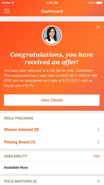
PwC Talent Exchange’s Mobile-first design
The PwC Talent Exchange app is a mobile product designed to connect talents with open opportunities at PwC. With a well-designed and user-friendly interface, the app allows candidates to search, express interest and join in challenging PwC projects – all on their mobile devices.
With PwC Talent Exchange, it’s not only the opportunity being exchanged. It’s also the long-term relationships with talents that PwC is building and taking care of.
“Best platform to make your dreams come true. Try it and experience a new change in your career” “Great application! Helps talents to build relationships with a great firm like PwC,” etc. are what users talk about the app.
Rakuna ( IOS, Android )
Rakuna Recruit is a ground-breaking campus & event mobile recruiting application used by organizations like National Grid, Sensata Technology, Applied Materials, etc.
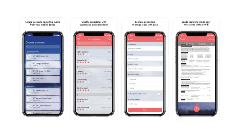
Rakuna’s Intuitive Mobile App
Available on iOS and Android, the Rakuna Recruit mobile recruiting software can streamline your event recruitment operation by eliminating time-consuming manual resume-taking processes. With the innovative Snapshot technology, users can instantly capture a candidate’s resume info.
The option for manual data input is always available for increased accuracy and customization. With Rakuna Recruit by your side, you can now pay more attention to building connections with their prospective candidates at offline events.
With Rakuna Recruit, mobile recruiting has never been easier. This versatile recruiting app is capable of storing information offline. Companies can use the app at on-site job fairs even if there is no wifi.
For companies with large pools of candidates, the app enables a recruiter to manage their stream of applicants on the go. Additionally, recruiters can easily rate and leave notes using simple qualification forms on a specific resume to assist with filtering and prioritizing follow-up actions using the web Dashboard.
See how Rakuna Recruit supports Southern Company – a gas and electric utility holding business optimizing their recruitment pipeline to engage with young candidates.
When using this mobile recruiting app at a recruiting event, you are never alone. The eager and energetic customer support team is available round-the-clock. Finally, If you are looking to hire talented Gen Z-ers, you need more than just a good product and employee benefits. Impress your candidates by showing zero tolerance towards paper usage through the use of Rakuna Recruit.
WhatsApp ( IOS, Android )
People know WhatsApp as the world’s most common instant messaging app with 1.5 billion users. Most people would be forgiven for thinking it is impossible to turn Whatsapp into a practical mobile recruiting application.
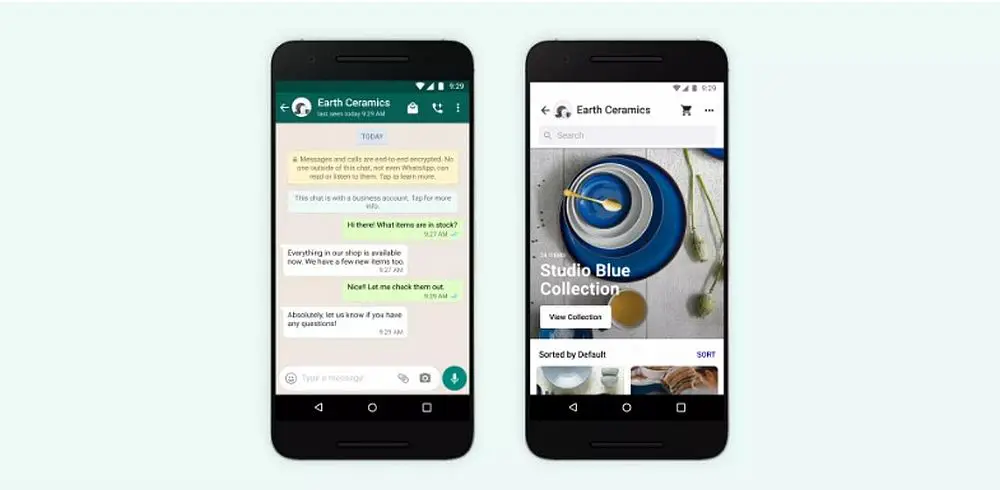
WhatsApp’s sleek and minimalist design
Gen Zs are steadily gravitating towards the app for its surprisingly high privacy measures. According to the “Q3 Social flagship report” generated by the Global Web Index, out of 151,213 internet users aged 16 to 64, 51% of the Gen Z age group said they use Whatsapp daily. Recruiters now have the chance to turn this messaging app into a potential candidate pool of young, aspiring talents.
Possessing a near 100% open rate, one would miss the chance of a lifetime to not recruit on Whatsapp. Emails are quickly unread or unanswered, whereas young users are more likely to check their phone when they hear the tell-tale tone of a missed message. Since smartphone owners are connected to their devices from early morning to late evening, it is also a perfect opportunity for global recruiters to find answers to time-sensitive problems from candidates in different time zones.
The core characteristic that makes Whatsapp an ideal mobile recruiting application is its direct nature. Instead of sending an email and waiting for a response, WhatsApp provides a direct communication line between recruiters and candidates. WhatsApp can store and back your information and contact for an extended period. The app’s data comes with your phone number so you can continue your recruiting endeavors without the worry of losing your contacts.
Above all, Whatsapp is still a messaging app with reliable messaging and video call capability. The application, created with phone users in mind, offers the best-in-class service regarding phone stability, compactness, and a wide range of networking features suitable to connect recruiters and candidates.
J&J BE VITAL ( iOS, Android )
The J&J BE VITAL app is a social network designed by the Johnson & Johnson company. The app helps university students build their career paths and discover Johnson & Johnson by connecting students with their mentors.
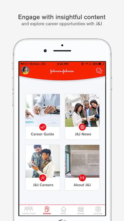
J&J BE VITAL’s detailed UI
Students can create a profile with the app, including the name of their university, their major, and their expected year of graduation. Then the app will match them with a mentor with a similar background. Both might be in the same field, go to the same university, or share interests.
“Making that connection gives students someone who was in their shoes a couple of years ago, who truly understands the journey from campus life to looking at different career opportunities,” said Marc Mascolo, Global Head of Campus & Early Talent Strategy at Johnson & Johnson.
What makes the app special is that students can have one-on-one conversations with their mentors. Topics are various: personal branding, interview tips, what it’s like to work in Johnson & Johnson, etc.
Their mentor will help guide them throughout their journey of finding their best-suited career path. This personalized and digital connection makes it easier for students to gain deep insights into the company. That’s what short conversations at career fairs or some introduction lines on the company’s website can’t.
“Everything has moved into a digital information consumption model. University recruiting had to move in that direction as well,” said Marc.
J&J has successfully used mobile recruiting application. They are developing more functions and improving students’ experience on the J&J BE VITAL app with a vision of “re-imagining university recruiting.”
Conclusion
And that is how you should and should not design a mobile-first app/website. With smartphone usage continuing to rise with each generation, adopting a mobile-first approach is one of the best investments a recruiting team could take to gain more candidates.Contact us for a quick demo if you want to experience Rakuna’s intuitive Mobile Recruiting App and start reeling in quality candidates!
Subscribe
All the recruiting news you see here, delivered straight to your inbox.
Just enter your e-mail address below
RecruitingBlogs on Twitter
Groups
-
Recruiters On LinkedIn
1801 members
-
Corporate Recruiters
316 members
-
Recruiting tips for begi…
180 members
-
The Recruiting Bar
190 members
-
Recruiting Humor
222 members
-
News from the Recruiting…
34 members
-
Contractors Recruitment
62 members
-
Recruitment Process Outs…
194 members
-
Virtual Recruiters Netwo…
619 members
-
Independent Recruiters
530 members
© 2024 All Rights Reserved
Powered by
![]()
Badges | Report an Issue | Privacy Policy | Terms of Service
About
With over 100K strong in our network, RecruitingBlogs.com is part of the RecruitingDaily.com, LLC family of Recruiting and HR communities.
Our goal is to provide information that is meaningful. Without compromise, our community comes first.
Join the Network!
RecruitingDaily.com
One Reservoir Corporate Drive
4 Research Drive – Suite 402
Shelton, CT 06484
Email us: info@recruitingdaily.com

You need to be a member of RecruitingBlogs to add comments!
Join RecruitingBlogs